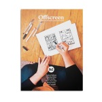
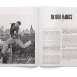
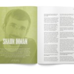
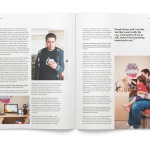
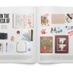
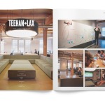
After a short delay of a week or so, I’m finally able to announce the release of Offscreen issue #2. As with the first issue, a longer post about the making-of will follow soon. For now, enjoy the preview and—hopefully—order your copy here.
Sweep the Sleaze
If you provide excellent content, social media users will take the time to read and talk about it in their networks. That’s what you really want. You don’t want a cheap thumbs up, you want your readers to talk about your content with their own voice.
Interesting that sites saw greater social media usage when removing “like” buttons – makes sense – if someone ‘likes’ a page in Facebook you basically don’t see it, but if they manually link to it, they generally provide some commentary and that in turn gets more promotion across their friends timelines.
Coda 2 (and Diet Coda)
Having used Coda for years, and still finding myself flip-flopping between Coda, TextMate, TextWrangler and Sublime Text 2 (all in the space of a day usually!) here’s hoping Coda 2 can whet my appetite and become my default editor of choice…
Coda 2 represents a incredible overhaul of every facet of our venerable all-in-one web code editor. It’s a release packed with tons of improvements that will make you more efficient and faster at your job. And on top of that, it’s got brand new features that will make it an even more indispensable part of your process.
And Diet Coda seems the perfect “little” companion…
Love the look of this…
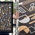
Introducing The Letters Poster. A creative collaboration from 55 Hi’s & Skinny Ships featuring a collection of original letterforms presented in shiny metallic-gold glory. Each poster is an 18×24, 2-color screenprint in a limited edition run of 200.
Project management and the design professional
Project management and the design professional
Andy Rutledge, principal and chief design strategist for Unit Interactive, claims project managers often do more harm than good and looks at what they actually do and what they should be doing in order for a project to succeed.
Thought provoking take on roles and responsibilities within an agency…
That’s not all these apps do, but it’s one benefit of using them, and it indicates how pathetic much of our web design is when our visitors increasingly turn to third party applications simply to read our sites’ content. It also suggests that those who don’t design for readers might soon not be designing for anyone.
– Jeffrey Zeldman “Web Design Manifesto 2012”
I love nothing more than flipping through FlipBoard and Zite on my iPad these days, and I’m finding finding I save more and more content to Pocket to easily read at a later time.
Offscreen Magazine — a print magazine about pixel people
Offscreen Magazine — a print magazine about pixel people

A new, collectible print magazine about the human side of websites and apps.
It’s been a long while since I’ve read a magazine so intently from cover to cover – I fell in love with everything about this magazine – from the idea, the feel, the stock, the design, the smell(!) and the fascinating content from people I’ve so long admired. Can’t wait for the next issue to arrive.
The design of a signage typeface
The design of a signage typeface
Once I even ended up in a holding cell at the border crossing to Norway, because the customs officers just wouldn’t accept that someone would drive all over Europe simply to take photographs of traffic signs.
Facts, 360 B.C. – A.D. 2012
To the shock of most sentient beings, Facts died Wednesday, April 18, after a long battle for relevancy with the 24-hour news cycle, blogs and the Internet.
Think Quarterly – The Creativity Issue
Think Quarterly – The Creativity Issue
Technology unlocks childlike wonder in all of us. Every day – every second – there is something new online. This lets us grown-ups be both endlessly curious and profoundly creative.
